
Lessons about UI (page 9)
The links, tools and tips our engineers and designers share with each other, one “today I learned” at a time.
- lessons shared
- 217
- people sharing
- 20
- database started in
- 2017








Tech Insights· medium.com
UI Animations with React — The Right Way
Shared by
Read on medium.com- Animations
- React
- UI
ux.stackexchange.com
interesting discussion about density and visual hierarchy for Settings pages
Aline Silveira
Tech Insights· ux.stackexchange.com
interesting discussion about density and visual hierarchy for Settings pages
Shared by
Read on ux.stackexchange.com- UI
- UX
Tech Insights· tobiasahlin.com
It’s very practical to use mouse cursor icons across your UI mockups to indicate hover, drag and blocked states on desktop. Here’s an asset with all available cursor states:
Shared by
Read on tobiasahlin.com- Design
- UI
Tech Insights· medium.muz.li
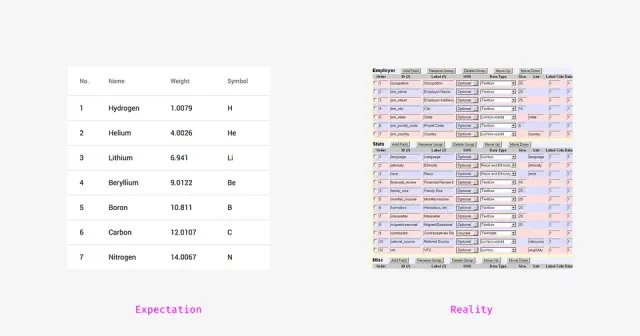
How to Design Large and Complex Web Tables
Shared by
Read on medium.muz.li- Design
- Tables
- UI
- UX
Tech Insights· shutterstock.com
Illustrator has a new tool for freeform gradients, and it’s awesome
Shared by
Read on shutterstock.com- Graphics
- UI
Tech Insights· medium.com
Redesigning Tokopedia’s Search Filter
Shared by
Read on medium.com- Redesign
- UI
link.medium.com
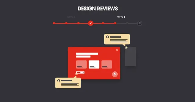
How a UI process can help you get the right client feedback at the right time
Pedro Bacelar
Tech Insights· link.medium.com
How a UI process can help you get the right client feedback at the right time
Shared by
Read on link.medium.com- Design Process
- UI
- UX
uxmovement.com
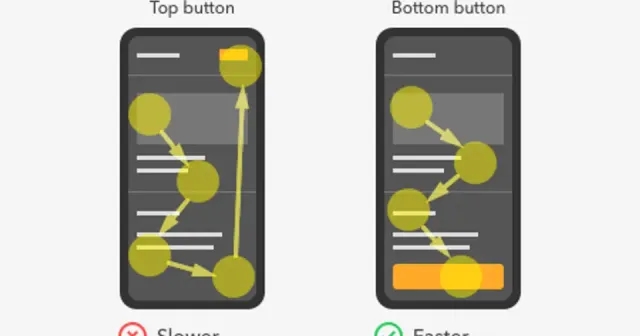
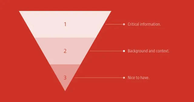
The Optimal Placement for Mobile Call to Action Buttons
Did you know that where you place your buttons affects how fast users complete their task? Quicker task completion results in a more satisfying experience. If this is what you want, you have to place your buttons where users expect to find them. Here’s a comprehensive analysis of all the button placements you could use. […]
Pedro Bacelar
Tech Insights· uxmovement.com
The Optimal Placement for Mobile Call to Action Buttons
From uxmovement.com
Did you know that where you place your buttons affects how fast users complete their task? Quicker task completion results in a more satisfying experience. If this is what you want, you have to place your buttons where users expect to find them. Here’s a comprehensive analysis of all the button placements you could use. […]
Shared by
Read on uxmovement.com- Mobile
- UI
- UX

smashingmagazine.com
the pros and cons of ghost buttons
Though we have a good understanding of the types of button design rules that universally work, there will be times when you’re surprised by a rogue element that performs well. Like ghost buttons. They aren’t much of a mystery, despite their eerie-sounding name. They’re call-to-action (CTA) buttons for your website, like any other. The key difference is in how they look. Logic would dictate that ghost buttons are not good for web design. Yet, research shows us that visitors don’t necessarily see them that way.
Aline Silveira
Tech Insights· smashingmagazine.com
the pros and cons of ghost buttons
From smashingmagazine.com
Though we have a good understanding of the types of button design rules that universally work, there will be times when you’re surprised by a rogue element that performs well. Like ghost buttons. They aren’t much of a mystery, despite their eerie-sounding name. They’re call-to-action (CTA) buttons for your website, like any other. The key difference is in how they look. Logic would dictate that ghost buttons are not good for web design. Yet, research shows us that visitors don’t necessarily see them that way.
Shared by
Read on smashingmagazine.com- UI

Tech Insights· medium.com
dealing with color in design systems
Shared by
Read on medium.com- Design System
- Design System
- Tools
- UI
justinmind.com
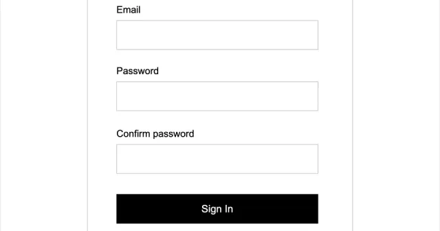
Prototyping Forms and Inputs using Justinmind
With Justinmind, you can create interactive forms in your prototypes to simulate user input experiences, such as registration, login, and search forms.
Pedro Bacelar
Tech Insights· justinmind.com
Prototyping Forms and Inputs using Justinmind
From justinmind.com
With Justinmind, you can create interactive forms in your prototypes to simulate user input experiences, such as registration, login, and search forms.
Shared by
Read on justinmind.com- Design
- Form
- Prototyping
- UI
Tech Insights· uxdesign.cc
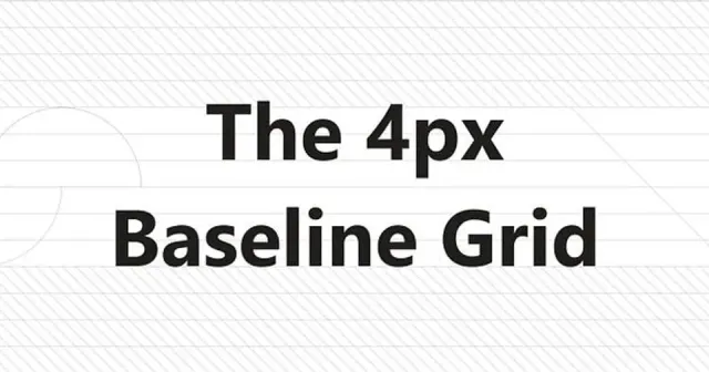
The 4px Baseline Grid : How to use it and why is it important for UI design
Shared by
Read on uxdesign.cc- Design
- Typography
- UI

Tech Insights· uxdesign.cc
A very insightful article on how designers deal with tools
Shared by
Read on uxdesign.cc- Tools
- UI
- Workflow
learnui.design
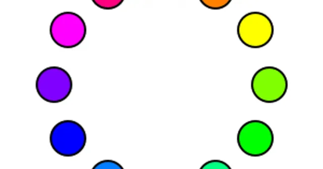
a beginner-friendly explanation of the HSB color system
Hue, saturation, and brightness, explained · Color variations with hue · Adjusting visibility with saturation · Black vs. white · HSL vs HSB
Aline Silveira
Tech Insights· learnui.design
a beginner-friendly explanation of the HSB color system
From learnui.design
Hue, saturation, and brightness, explained · Color variations with hue · Adjusting visibility with saturation · Black vs. white · HSL vs HSB
Shared by
Read on learnui.design- Color Systems
- UI
Book a call
Found it useful?
Let’s put it to work.
Tell us about your product and the problem in front of you. We’ll bring what we’ve learned on real projects.
Tell us about your product, and we’ll bring what we’ve learned.
Still prefer the good old email? Contact us