Lessons about UX (page 8)
The links, tools and tips our engineers and designers share with each other, one “today I learned” at a time.
- lessons shared
- 202
- people sharing
- 23
- database started in
- 2016








Tech Insights· uxdesign.cc
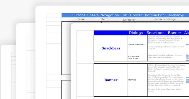
Cheat Sheets: UI Terms used by Product Designers
Shared by
Read on uxdesign.cc- Cheat Sheet
- Design
- Terminology
- UI
- UX

uxpin.com
Moderated vs Unmoderated usability test: which is better?
A practical analysis of both types of usability tests. Learn the pros and cons for the most informed decision.
Aline Silveira
Tech Insights· uxpin.com
Moderated vs Unmoderated usability test: which is better?
From uxpin.com
A practical analysis of both types of usability tests. Learn the pros and cons for the most informed decision.
Shared by
Read on uxpin.com- Design
- Usability Test
- UX
Tech Insights
2020 Growth Hacker’s Guide To Ecommerce Success ttps://d2saw6je89goi1.cloudfront.net/uploads/digital_asset/file/609498/The_Growth_Hacker_s_Guide_To_Ecommerce_Success.pdf
Shared by
- Ecommerce
- Surveys
- UX
Tech Insights· uxdesign.cc
Guidelines for shopping carts on e-commerce checkouts
Shared by
Read on uxdesign.cc- Checkout
- UI
- UX
Tech Insights· uxdesign.cc
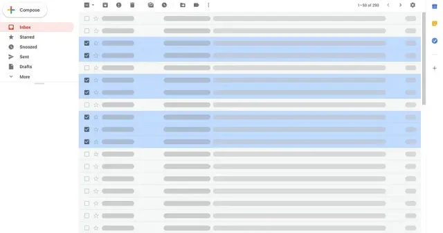
The bulk experience: exploring multi-select and bulk actions
Shared by
Read on uxdesign.cc- Bulk
- Design
- UI
- UX
Tech Insights· medium.com
“Designing a system that makes it easy to do bad things is bad”. Erika Hall on the ethics of UX design
Shared by
Read on medium.com- Design
- Ethics
- UX

smashingmagazine.com
how to improve our design process while dealing with complex product scenarios
Think about your last few software projects. Was there a healthy balance between concrete business goals, meeting users’ needs, and shipping the product in a timely fashion? The key to striking this balance is a design process that accounts for complexity, addresses design problems early, and avoids relying too heavily on third parties. A major contributor to clunky software is flawed design processes. In this article, Eric Olive will outline four design process problems and explain how to address them.
Aline Silveira
Tech Insights· smashingmagazine.com
how to improve our design process while dealing with complex product scenarios
From smashingmagazine.com
Think about your last few software projects. Was there a healthy balance between concrete business goals, meeting users’ needs, and shipping the product in a timely fashion? The key to striking this balance is a design process that accounts for complexity, addresses design problems early, and avoids relying too heavily on third parties. A major contributor to clunky software is flawed design processes. In this article, Eric Olive will outline four design process problems and explain how to address them.
Shared by
Read on smashingmagazine.com- Design
- Process
- UX
Tech Insights· producthunt.com
A 7-step process to run audience research interviews
Shared by
Read on producthunt.com- User Interviewing
- UX
nngroup.com
“The big problem with the 3-click rule is that it has not been supported by data in any published studies to date. In fact, a...
“The big problem with the 3-click rule is that it has not been supported by data in any published studies to date. In fact, a study by Joshua Porter has debunked it;” - The 3-Click Rule for Navigation Is False
Lais Varejão
Tech Insights· nngroup.com
“The big problem with the 3-click rule is that it has not been supported by data in any published studies to date. In fact, a...
“The big problem with the 3-click rule is that it has not been supported by data in any published studies to date. In fact, a study by Joshua Porter has debunked it;” - The 3-Click Rule for Navigation Is False
Shared by
Read on nngroup.com- UX
nngroup.com
great guidelines for designing breadcrumbs and secondary navigation
Support wayfinding by including breadcrumbs that reflect your site's information hierarchy. On mobile, avoid using breadcrumbs that are too tiny or wrap.
Aline Silveira
Tech Insights· nngroup.com
great guidelines for designing breadcrumbs and secondary navigation
From nngroup.com
Support wayfinding by including breadcrumbs that reflect your site's information hierarchy. On mobile, avoid using breadcrumbs that are too tiny or wrap.
Shared by
Read on nngroup.com- Design
- Navigation
- UI
- UX
css-tricks.com
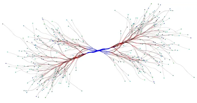
The Great Divide - Should we split the Front end Engineer into JS Engineer and UX Engineer?
Let’s say there is a divide happening in front-end development. I feel it, but it's not just in my bones. Based on an awful lot of written developer
João Lins
Tech Insights· css-tricks.com
The Great Divide - Should we split the Front end Engineer into JS Engineer and UX Engineer?
From css-tricks.com
Let’s say there is a divide happening in front-end development. I feel it, but it's not just in my bones. Based on an awful lot of written developer
Shared by
Read on css-tricks.com- CSS
- Frontend
- JavaScript
- UX
ux.stackexchange.com
interesting discussion about density and visual hierarchy for Settings pages
Aline Silveira
Tech Insights· ux.stackexchange.com
interesting discussion about density and visual hierarchy for Settings pages
Shared by
Read on ux.stackexchange.com- UI
- UX

Tech Insights· medium.muz.li
How to Design Large and Complex Web Tables
Shared by
Read on medium.muz.li- Design
- Tables
- UI
- UX
link.medium.com
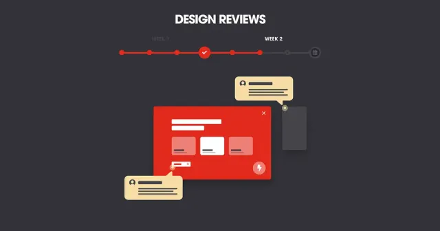
How a UI process can help you get the right client feedback at the right time
Pedro Bacelar
Tech Insights· link.medium.com
How a UI process can help you get the right client feedback at the right time
Shared by
Read on link.medium.com- Design Process
- UI
- UX
uxmovement.com
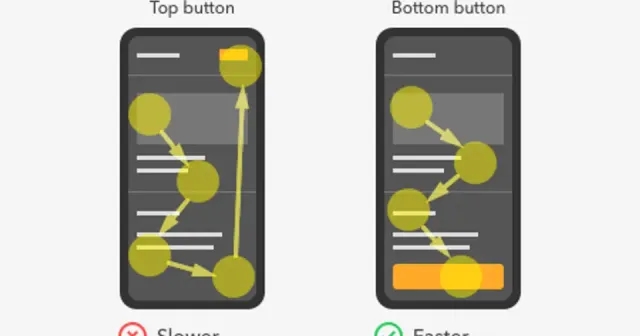
The Optimal Placement for Mobile Call to Action Buttons
Did you know that where you place your buttons affects how fast users complete their task? Quicker task completion results in a more satisfying experience. If this is what you want, you have to place your buttons where users expect to find them. Here’s a comprehensive analysis of all the button placements you could use. […]
Pedro Bacelar
Tech Insights· uxmovement.com
The Optimal Placement for Mobile Call to Action Buttons
From uxmovement.com
Did you know that where you place your buttons affects how fast users complete their task? Quicker task completion results in a more satisfying experience. If this is what you want, you have to place your buttons where users expect to find them. Here’s a comprehensive analysis of all the button placements you could use. […]
Shared by
Read on uxmovement.com- Mobile
- UI
- UX
Book a call
Found it useful?
Let’s put it to work.
Tell us about your product and the problem in front of you. We’ll bring what we’ve learned on real projects.
Tell us about your product, and we’ll bring what we’ve learned.
Still prefer the good old email? Contact us