Lessons about UI (page 4)
The links, tools and tips our engineers and designers share with each other, one “today I learned” at a time.
- lessons shared
- 217
- people sharing
- 20
- database started in
- 2017








Tech Insights· figma.com
Playground for learning how to use the new Interactive Components feature for Figma (Beta)-(Community)?node-id=0%3A1
Shared by
Read on figma.com- Design
- Design Tool
- Figma
- Playground
- UI
Tech Insights· futurelearn.com
Making sense of atomic design: molecules and organisms
Shared by
Read on futurelearn.com- Atomic
- Atomic Design
- Design
- Design Ops
- Design System
- Design System
- UI
Tech Insights· figma.com
Universal search bar for Figma, fetch assets faster from your design system
Shared by
Read on figma.com- Design
- Figma
- Plugin
- UI
github.com
Collaborative git repository for awesome design tools (accessibility, animation, AR, color picking, handoff and much more)
The best design tools and plugins for everything 👉 - goabstract/Awesome-Design-Tools
Pedro Bacelar
Tech Insights· github.com
Collaborative git repository for awesome design tools (accessibility, animation, AR, color picking, handoff and much more)
From github.com
The best design tools and plugins for everything 👉 - goabstract/Awesome-Design-Tools
Shared by
Read on github.com- Accessibility
- Animation
- Ar
- Color
- Community
- Design
- Handoff
- Open Source
- Repository
- UI
- UX
Tech Insights· uxbooth.com
Designing User-Friendly Data Tables
Shared by
Read on uxbooth.com- Data
- Design
- Table
- UI
- UX

Tech Insights· blog.prototypr.io
Design for Coherence, not Consistency
Shared by
Read on blog.prototypr.io- Design
- Design System
- Design System
- UI
- UX
uxpin.com
Atomic Design Systems: A Checklist for Each Individual Design Component
Use this checklist to make sure that your atomic design system includes all of the individual design components that you need to build amazing UIs.
Pedro Bacelar
Tech Insights· uxpin.com
Atomic Design Systems: A Checklist for Each Individual Design Component
From uxpin.com
Use this checklist to make sure that your atomic design system includes all of the individual design components that you need to build amazing UIs.
Shared by
Read on uxpin.com- Atomic
- Atomic Design
- Design
- Design System
- Design System
- UI

Tech Insights· verywellmind.com
Color psychology and how it affects the way you feel
Shared by
Read on verywellmind.com- Design
- UI
Tech Insights· medium.com
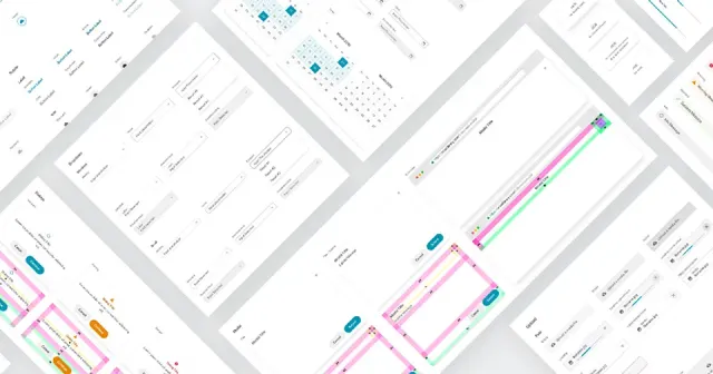
How we improved the workflow between product designers and frontends
Shared by
Read on medium.com- Design
- Design System
- Design System
- Front End
- UI

Tech Insights· uxdesign.cc
Designing for accessibility is not that hard:
Shared by
Read on uxdesign.cc- Accessibility
- Design
- UI
- UX
Tech Insights· blog.prototypr.io
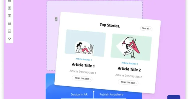
Building a Drag and Drop UI
Shared by
Read on blog.prototypr.io- Acessibility
- Design
- Interaction
- Responsiveness
- UI
- UX

appcues.com
Tooltips: How to use this small but mighty UI pattern correctly
Learn how to design effective tooltips with real-world examples, best practices, accessibility tips, and step-by-step creation methods for web and mobile.
Laura Lemos
Tech Insights· appcues.com
Tooltips: How to use this small but mighty UI pattern correctly
From appcues.com
Learn how to design effective tooltips with real-world examples, best practices, accessibility tips, and step-by-step creation methods for web and mobile.
Shared by
Read on appcues.com- Accessibility
- Design
- Tooltips
- UI
- Usability
- UX

adamsilver.io
The problems with tooltips and what to do instead
Tooltips are not only hard to use, but they're normally totally unnecessary. Learn why that is and what you could do instead.
Laura Lemos
Tech Insights· adamsilver.io
The problems with tooltips and what to do instead
From adamsilver.io
Tooltips are not only hard to use, but they're normally totally unnecessary. Learn why that is and what you could do instead.
Shared by
Read on adamsilver.io- Accessibility
- Design
- Tooltips
- UI
- Usability
- UX
trychameleon.com
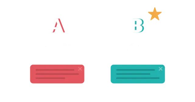
Why Tooltips are Terrible and How to Better Design Them
Discover SaaS tooltip design best practices, examples, and in-app tooltips UX to guide users, enhance UI clarity, and improve the overall product experience.
Laura Lemos
Tech Insights· trychameleon.com
Why Tooltips are Terrible and How to Better Design Them
From trychameleon.com
Discover SaaS tooltip design best practices, examples, and in-app tooltips UX to guide users, enhance UI clarity, and improve the overall product experience.
Shared by
Read on trychameleon.com- Accessibility
- Design
- Tooltips
- UI
- Usability
- UX
uxmovement.com
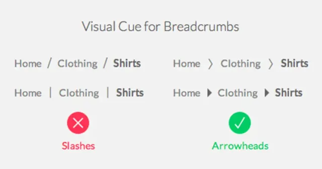
When You Should Use a Breadcrumb Navigation
If you’re ever lost in a large territory, the first thing you’d want to know is where you are. Once you know that you can figure out how far you are from your destination. This is why shopping malls offer wayfinding maps with “You are here” indicators. Users want to know where they are when […]
Pedro Bacelar
Tech Insights· uxmovement.com
When You Should Use a Breadcrumb Navigation
From uxmovement.com
If you’re ever lost in a large territory, the first thing you’d want to know is where you are. Once you know that you can figure out how far you are from your destination. This is why shopping malls offer wayfinding maps with “You are here” indicators. Users want to know where they are when […]
Shared by
Read on uxmovement.com- Design
- Navigation
- UI
Book a call
Found it useful?
Let’s put it to work.
Tell us about your product and the problem in front of you. We’ll bring what we’ve learned on real projects.
Tell us about your product, and we’ll bring what we’ve learned.
Still prefer the good old email? Contact us